There is an old adage which states, “how you say something is just as important as what you say”. I believe this to be true. You can’t give a serious presentation while giggling like a schoolgirl or warning of the dangers and hazards in the home while making toast in the bathtub. The same is true of the written word as the spoken word; I am about halfway through (what? I’ve been busy!) Steve Jobs’ biography by Walter Isaacson and it is obvious that Steve knew the importance of proper typography and fonts. I like reading about his passion for perfect kerning and the use of sans-serif fonts for user interfaces, not just at the command line but in bitmapped Graphical User Interfaces (GUI) too.
The web has always been a dangerous place for fonts. Different browsers on different operating systems means you can’t guarantee that the font you designed your page with will be there when the user comes to view your page. Adobe (nee, Macromedia) Flash allows you to embed fonts into movies so you can be pretty sure that what you design will be what is shown to your users, but the web is a warzone. There have been attempts by browser vendors to allow font files to be embedded into web pages, but the bitterness between the vendors have made settling on a standard rather difficult… that is until recently when it became obvious that in order to survive in the Post-PC era you need to be very standards-accepting.
The Most Beautiful Website in the World?
I certainly don’t mean this site – unfortunately I don’t have the spare time to make my blog as pretty as I’d like – I’m too busy (did I already say that?). However, the reason why I’ve been spurred on to write this today is that I saw an article on Fast Co.’s website which made me take a step back and go, “wow, that’s very nice.” Not a lot of websites do that…
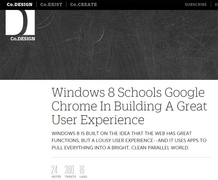
Have a look at this: http://www.fastcodesign.com/1669796/windows-8-schools-google-chrome-in-building-a-great-user-experience
The content of the article (although interesting and informative) is The headline is crisp and stands out. That chicane in the blackboard picture makes a powerful and simple visual cue to guide you to the meat of the article, and serves to keep the periphery content (ads) psychologically separate.
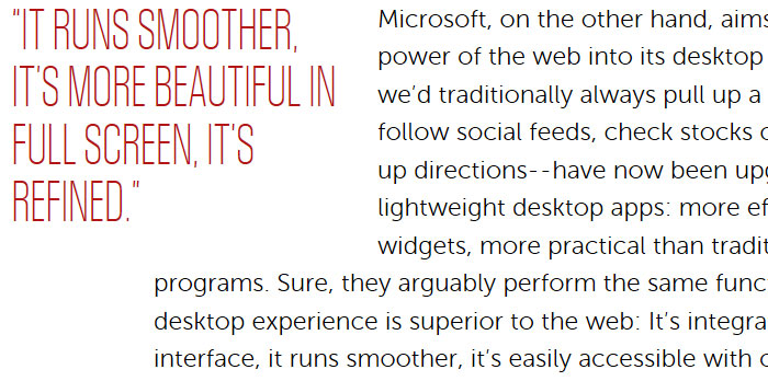
The subheading and the excerpts are both displayed in upper case typography, and yet neither shouts at you. The red excerpts look like they’ve been ripped straight out of a magazine article.
So what is it that is setting this website apart from its rivals? I’ve already mentioned it several times: Typography.
You don’t have the fonts on this website on your PC, yet there they are in all their glory. This website uses Web Fonts, or more specifically, these are Embedded OpenType fonts, EOTs. And Web Fonts are making the web so much nicer to look at.
Web Fonts
Back in 1994, Microsoft started working on an open font format for the web. Soon afterwards, Adobe got in on the deal too. The result, “OpenType“, is built on top of Apple’s TrueType standard, the font system you’re used to (even if you didn’t know it!) when word-processing, OpenType is designed to get around one of the main problems with embedding fonts on the web – Digital Rights Management or DRM. If you spend ages creating a font for your website, or your publication, etc., you want the commercial rewards of that effort – that means retaining control of where that font file ends up. Embedding your font in a webpage means it has to be downloaded to each PC that it is viewed on; that means your font ends up in the public domain and out of your control rather quickly. Depressing. The two solutions to this are: a) create a new DRM-enforced format for commercial fonts, or b) remove the monetisation aspect of fonts in favour of an open ecosystem where beautiful design and content is the reward. Counter-intuitively B has won. Take note, RIAA.
But Embedded Open Type (.eot) isn’t the only combatant in the open font wars (the lamest and seemingly most pointless war in the history of the world, admittedly). Microsoft are also a founding member of the consortium behind the Web Open Font Format – WOFF. WOFF is a wrapper around font files (including OpenType…), which includes metadata and compression. So while Microsoft are competing with themselves somewhat, it looks like the combination of .eot files and WOFF at least gives some options to web developers to beautify their website with custom fonts.
I don’t know how to make them but I want Free Web Fonts Now!
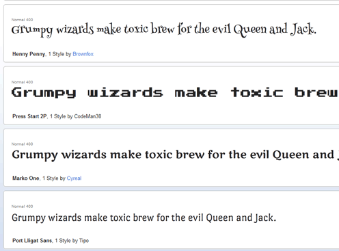
This is me taking humble pie out of the fridge, putting it in the oven, waiting for half an hour, and then having another big ol’ slice. Google have taken the baton and run with it, they’ve got a library of completely royalty-free web fonts available to you right now! Simply go to: http://www.google.com/webfonts. You can see some examples at the top of this article.
To use the fonts from Google Web Fonts, you simply insert a script tag on the page you want to use the font on, and then use CSS to reference the font:
<link href='http://fonts.googleapis.com/css?family=Henny+Penny' rel='stylesheet' type='text/css' />

<style type="text/css">
    .fancyPants{
        font-family: "Henny Penny", sans-serif;
    }
</style>

<p class="fancyPants">This text is really fancy.</p>
Which gives you this awesomeness:
This text is really fancy.
(If it just looks plain, try updating your browser once in a while, eh? 😉 )
What if I DO know how to make web fonts, but I want to get paid for it?
You’re not the only one. In fact, Fonts.com has a marketplace for commercial Web Fontery at http://webfonts.fonts.com.
For those of you running larger websites and want a more exclusive look, there are some pretty expensive, but still pretty, web fonts available on that site for your selection.
OK, so maybe “B” didn’t win quite so persuasively…


