When Andrew Kim was born in 1991, Microsoft were just putting the finishing touches to Windows 3.1 – the operating system that launched the company to international megasuccess. But 21 years later, Andrew Kim is trying to tell Microsoft how their brand should look. And do you know what? He’s completely right.
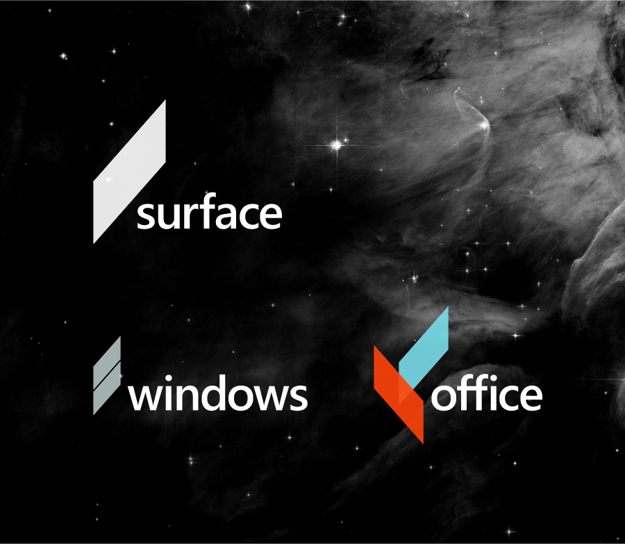
Andrew has started with the concept of “Windows” and challenged the 4-square motif that echoes not-so-much 21st century walls of glass and more Edwardian hash window.
Windows in the metropolis look nothing like four squares. This is the new design element I am proposing. I call it the ‘slate’.
The slate isn’t just a replacement for Windows, as you can see in the image, Andrew has tackled Office and the new Surface tablet/flipbook things too. Interestingly, Andrew has included Windows Phone in the Surface branding – this is very smart, and would go some distance to consolidating Microsoft’s sometimes confusing estate of products.
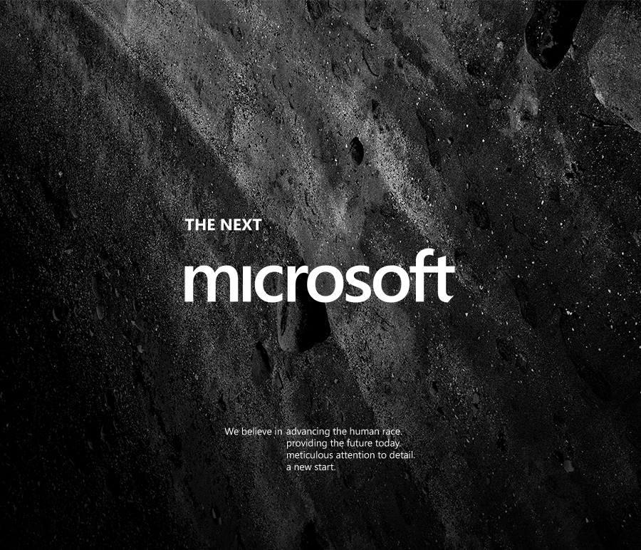
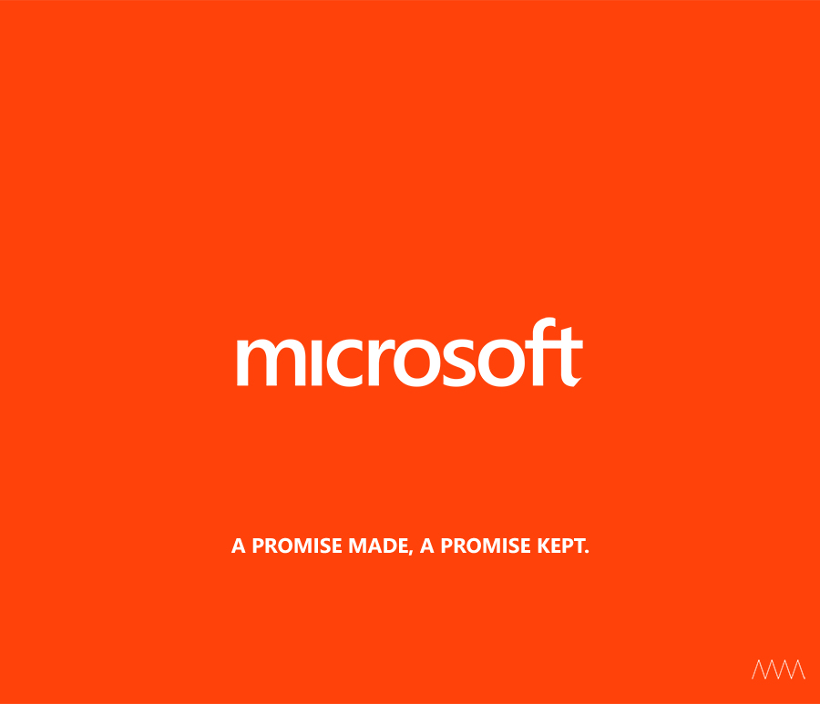
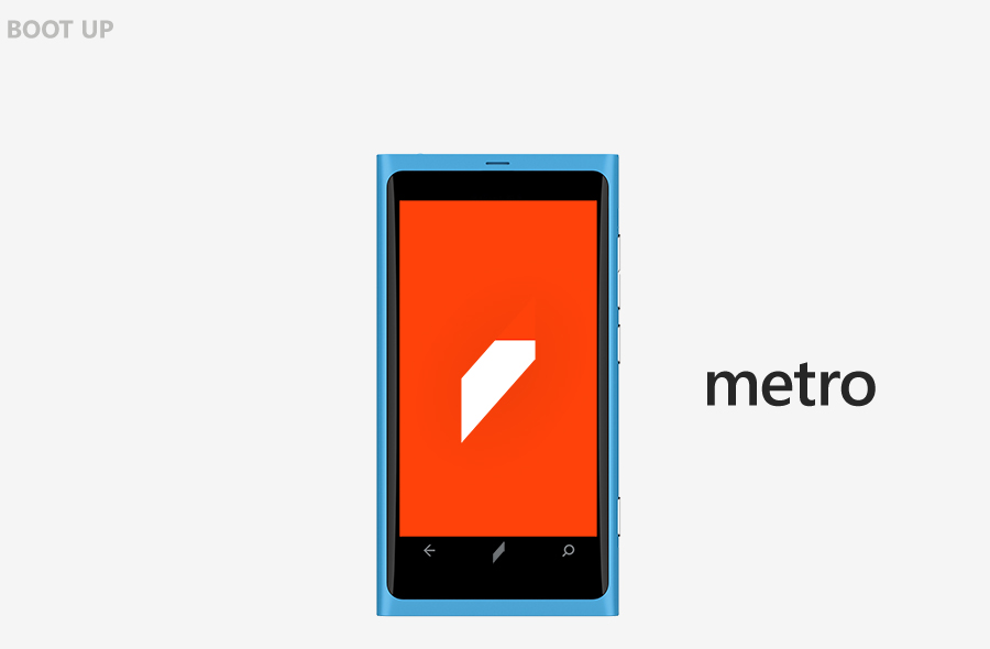
I’ve complained in the past that Microsoft’s new Windows 8 “window” looked like the work of a first year design student, but Andrew Kim has proven me completely wrong – design students could do much, much better. He hasn’t just revamped the product line either, he’s taken a look at the “Microsoft” logo too and refreshed it with a new font and some astronomically good concepts for how it could be used:
You can see more of Andrew’s design wizardry at his website: http://www.minimallyminimal.com/journal/2012/7/3/the-next-microsoft.html
