There has been much press this week about Microsoft’s new annual-update programme for its Windows operating system, purported to be called “Windows Blue”. This has been mostly driven by the leak of an early copy of Blue onto file sharing websites.
WinSuperSite’s Paul Thurrott gives the best overview. As well as several new “Modern UI” (previously ‘Metro’) apps such as Alarms, Calculator, Sound Recorder and Movie Moments, a significant amount of the traditional Windows Desktop is being moved into the Modern UI too. For example, choosing which application to open certain file types with. This, as Paul suggests, could be an indication of Microsoft’s intention to eventually move everything into the Modern UI and get rid of “the Desktop”, as we all know it, completely. Perhaps in Windows 9?
The Start Menu
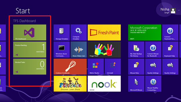
Today I had a bit of an epiphany when I saw a personalised Team Foundation Server (TFS) dashboard shown on the Windows 8 start menu. TFS is a system used by software developers to make backlogs, track bugs and keep track of code. I myself spend at least an hour, probably two or three, each day hunting through TFS for information. So this made me leap for joy:

Of course! That’s the paradigm shift! I have been wondering exactly how we’re supposed to use this Start Menu, and learn to embrace it rather than hate it, and now I get it! The Start Menu is your launchpad. You receive some information on the live tiles, you click on them to launch the full-screen Modern UI app, do your thing (send an email, reply to a Tweet, etc.) and then Whoosh! you’re back to the Start Menu for your next task.
That’s all it’s supposed to be, that’s why new Modern UI apps take up all the screen. It is Microsoft’s way of helping you focus in the modern world where everything is vying for your attention. That’s why, at most, you can have two apps side by side. But that’s all.
I announced my breakthrough to my development team at work. And it was quickly rebuked.
“I’m trying to use it as a dashboard but I keep getting distracted by the benign animations on things like the ‘Photos’ tile,” said Lloyd, my Team Leader.
And he’s right.
If it was clean, and live tiles were used properly – to catch your attention when it was necessary – it would work very well.
But the Start Menu is awash with noise. It’s a very busy, awkward interface. It has promise, but Microsoft has already confused its own message by creating live tiles with no real purpose. They’re just there to show off the technology – but in reality they’re hurting it. Badly.
 Touch First
Windows 8 has largely been slated by users and the technology press because it has clearly been designed to work on touch-screens first – and non-touch-screens (with traditional keyboard and mouse setups) second. I’ve covered this before. If you move your mouse to any corner of a screen you find invisible menus springing forth and covering up what you were trying to do. This is a massive hack to support the features you get on touch-screens (by swiping in from the sides, top and bottom) but with a mouse.
As a multi-monitor user I frequently snap a window to be full screen on one screen (so my mouse cursor is at the top of the screen) and then move the mouse cursor to another window to snap another app full-screen there. But because the corners now have special, and apparently I push forward slightly as I move my mouse cursor, the little pointer ends up getting “stuck” in between the monitors. This is a very jarring, fist-clenchingly frustrating experience. It’s such a minor thing but when it happens it feels like the computer has taken over your mouse and is actively preventing you from doing what you want to do.
And you know what? I move my cursor from screen to screen a hell of a lot more often than I want to use charms! And don’t even bother showing me the “Share” charm when I’m in the desktop because you’re only going to show the “Can’t share anything from the desktop” message. That’s a major breach of basic User Experience (UX) guidelines, right there.
I’ve also always been fond of double-clicking the top-left of a window to close it. While I still can do this if I’m careful in Windows 8, I usually end up triggering the preview of the last Modern UI app I had open, which hides the part of the application I was actually trying to use.
For years and years I’ve been able to use Word without things popping up reminding me that before Word, I opened up Minesweeper. It is a ridiculous feature that needs removing as soon as possible (Windows Blue maybe, Microsoft?). Except…. it is there for a purpose: to let you switch between the traditional desktop and Modern UI apps. There is no other way to do that (Except clicking on the app tile again in the Start Menu, but this feels like a “re-launch” behaviour).
The lack of a “taskbar” in the Modern UI world is also a huge failing. Taskbars provide context and allow for far faster task-switching than swiping. While also preventing the awkwardness of having to reclick a tile just to get back to an already-open Modern UI app.
Windows Blue: Modern UI and Traditional Desktop (For Now…)
Microsoft seems to think that the two worlds are split by technology: Modern UI (running on the Windows Runtime – or WinRT – technology stack) and the traditional desktop (running on Win32 APIs and various abstraction technologies) and to some degree they’re right but that’s the wrong delineation. That is very much the thinking of a software engineer and in no way represents the thinking of the typical user.
Modern UI is good for focussed tasks and the desktop is good for having lots of windows open and quick task switching. The desktop is the perfect environment for researching while writing a dissertation. For copy and pasting. For dragging images off websites. For comparing photographs while painting in Photoshop.
And thus the two worlds are suddenly very clearly separated and defined.
Modern UI is the perfect platform for consumption. The traditional desktop is the perfect platform for creation. That is the proper delineation between the two worlds.
So when Microsoft starts moving more and more things towards the Modern UI they think they are making a technology choice: “we’re just consolidating our technology stacks into one: WinRT!”, but, because they think like engineers not like real people, they’re about the shoot themselves in the foot.
Because if this focus on Modern UI means that the end of the traditional desktop is nigh, then that really means that Microsoft is killing off the ability to create.
And that is very sad. And very mad.
Some people need to create. That’s why books get written, art gets painted, sculptures get carved, faces of Presidents get cut into hillsides, bridges get built, etc. And if the desktop really is about to die, then those people will move somewhere else.
If that place offers a good consumption experience too, then by nothing more than word of mouth advertising between friends at light-speed on social networks, Microsoft Windows will fade into nothing.
And Microsoft will only have itself to blame.


