It has been 25 years since the last redesign but here it is, Microsoft’s new logo:
What do you think?
Microsoft’s New Logo
I do believe that companies should refresh themselves every so often. Microsoft’s old logo is a classic and timeless so there must have been something significant to have encouraged them to rethink the label that will go out on every box of software (and cloudy app) for the next… however long. Obviously that significant something was their much-loved, much-hyped Metro interface.
And while I believe in congruence in design and branding across an entire organisation, changing that shouldn’t be done for change’s sake. And in this case I suspect that changing the entire company’s face to coincide with a punt-in-the-dark user interface innovation on one of their myriad products (Windows 8) is possibly too much too soon. Especially when that innovation isn’t being very well-received. And that logo – Microsoft’s first – it’s just the stylised logo of Windows. So they’ve confused matters enormously by giving it the same colours of their Operating System product. In fact, they’ve missed a trick to come up with a set of four different colours with which to base their organisational (as opposed to commercial/product) brand.
So with the above in mind I confess: I really don’t like the design.
It is too basic. I’m all for minimalism but then there’s the caveat that minimalism mustn’t make you indistinct. Squares aren’t distinct! I read a great book (possibly by Charles Saatchi) about the secrets of branding and advertising. It said that your brand is only good if you could identify it from the opposite end of a dark corridor. Sure enough there was a graphic of a dark corridor and in the distance there was a large poster advert with a runner on it. In the bottom corner, there was a little red swooshy tick. Obviously Nike understand the dark secrets of building an effective brand!
But what of this? Surely if you saw those four squares, in those colours, at the other end of the hall you’d recognise it as being the new Microsoft logo. Wouldn’t you? Well, would you really be able to tell it apart from a distant Windows 98 logo? I suspect not. And that’s why it’s a fail on many levels.
Microsoft’s Previous Logos
Here are Microsoft’s other logos from the annals of time:
What Microsoft SHOULD Have Done…
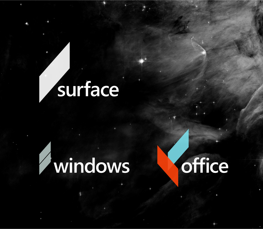
Microsoft should have hired Andrew Kim, the design student who has already tried to point the company in a new, distinctive design direction.
Here are a recap of Andrew’s suggestions:
Distinctive, different, identifiable from the other side of a darkened corridor, contemporary and entirely in-line with the new Metro interface while keeping its well-thought-through design credibility.
I can’t believe Microsoft had this on a plate and decided to do their own thing instead. And if you want to hear what I have to say about the Windows 8 logo (which ironically does away with the signature four-colours Windows icon in favour of an all-blue one??!?!?) click here.
Update (16:00 +0100 24/08/2012)
After a little bit of baiting, Microsoft IIS MVP (Most Valuable Professional) Andrew Westgarth responded to why they’ve used the colours they have (of course I didn’t keep #twitbaiting him :D):
@apwestgarth Is the dark, foreboding murkiness of the text the Online Services division? Or do we not talk of such things…? 😉— Richard Stokoe (@richardstokoe) August 24, 2012


