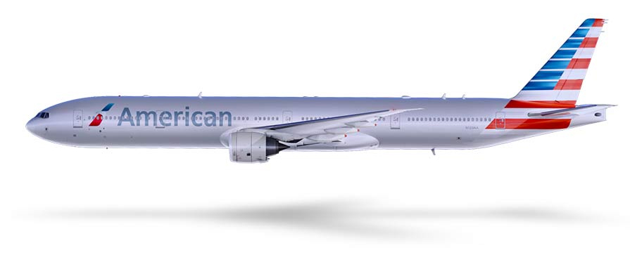
Today, after months of speculation and guesswork, the world finally got to see American Airlines’ new livery. Doing away with the bare-metal, full-length stripes and the “AA” with an eagle in the middle, the new paint scheme will work on the new all-composite aircraft coming out of Boeing and Airbus, which simply don’t allow for that “bare metal” look. (They’re not metal for a start!) The new livery is getting a mixed reaction, some love the new, modern style, while others think it is sacrilege to play around with such an iconic brand. The last time American got a new look was back in 1968, so this is an historic day in aviation. Its timing is telling of just how the company wants to leave its old image behind as it claws its way out of Chapter 11 bankruptcy protection.
The new Logo
Also joining the new livery is a new logo for the brand:
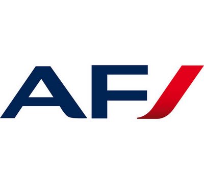
Retaining the eagle, although in a very stylised form, the logo is a lot more contemporary than its predecessor. However, its abstract design could make it less impactful. Some commenters are saying it looks too much like other logos, such as the one Air France recently adopted:
Do you like American Airlines’ New Livery and Logo?
What are your thoughts on the new “AA”? Have your say in the comments below.

